Editorial Layouts
The following are examples of layouts I created for various publications. Some issues include produced photography, in which I art directed, while others include purchased or repurposed content.
COTTAGE STYLE (BETTER HOMES & GARDENS) This magazine is a mix of new and existing content. Some stories were repurposed from sister publications, while others were newly acquired. It was important to me to design all of the content in a way that was fresh and ensure the new and existing photography were indecipherable from one another by making a cohesive look throughout. While doing that, I made sure to give each story in the issue its own personality that was cohesive with the overall feel of the content.
Taking It Easy: This story has lived several lives in other BHG publications, so I wanted to design it differently from what had been done before. I really leaned in to the design elements found in the home and incorporated them into the design elements throughout. This layout won the Award of Excellence in Editorial Design from ADAI (Art Directors Association of Iowa).︎︎︎


HOLIDAY CRAFTS (BETTER HOMES & GARDENS)
Each issue of Holiday Crafts features 70+ projects which are divided into chapters by theme. Typical layouts feature styled photos at the beginning of each chapter followed by instructions for each project. This particular issue was a “Best of” celebrating 50 years of the publication. We revisited projects from each decade, which was a challenge in and of itself, trying to work with old images and outdating styling, without making the overall issue feel dated.
1970s: This is the first main edit story in the issue and all subsequent chapters/decades are designed in a similar format. After doing a lot of research about each decade and determined popular color palettes and motifs from those eras, I designed graphic elements woven throughout each chapter to help hold all of the content together. At least one project from each chapter was reimagined and remade to fit more modern aesthetics; in those instances I treated the original images as photo inlays juxtaposed with the new photography.︎︎︎


BEDS & BORDERS (BETTER HOMES & GARDENS)
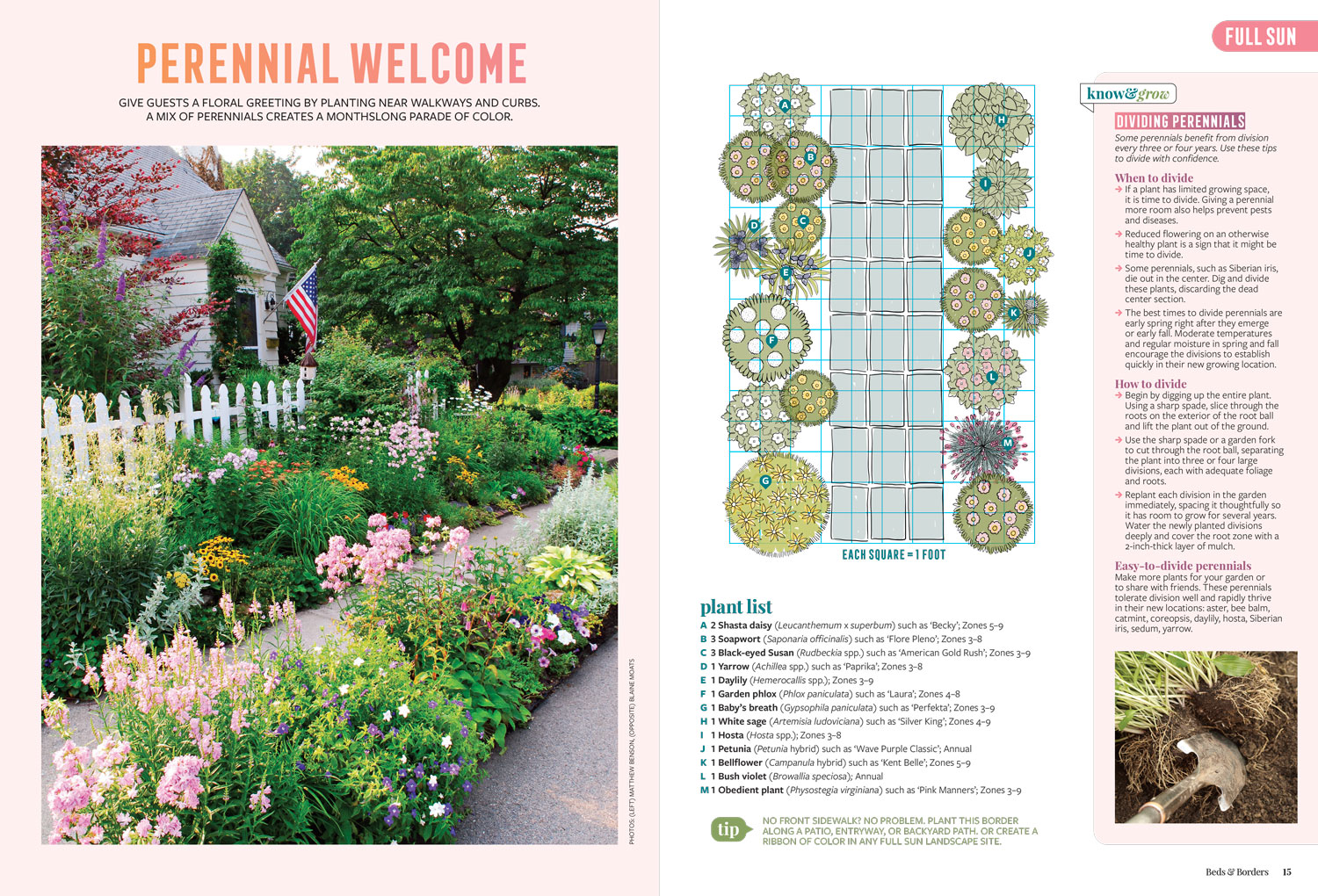
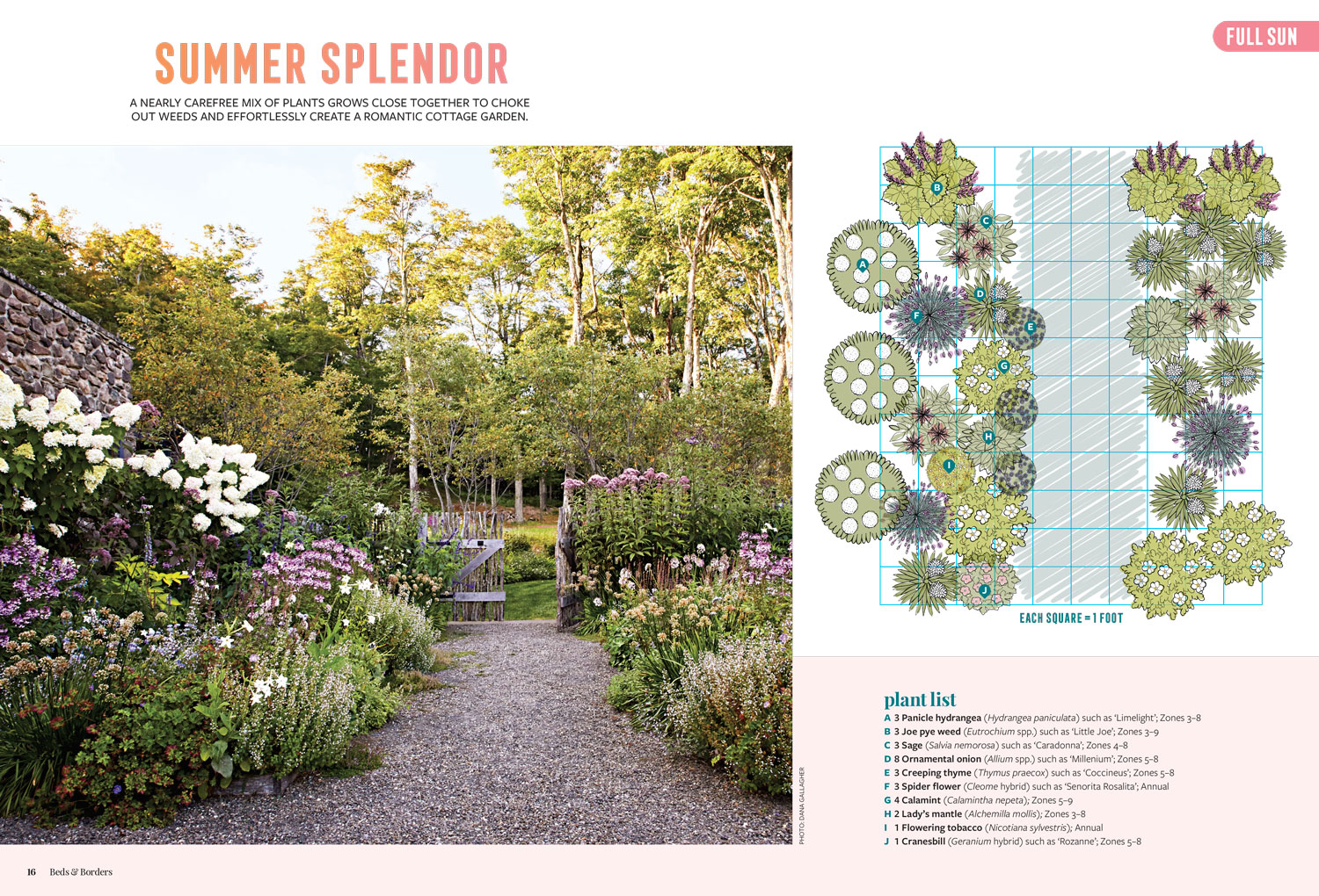
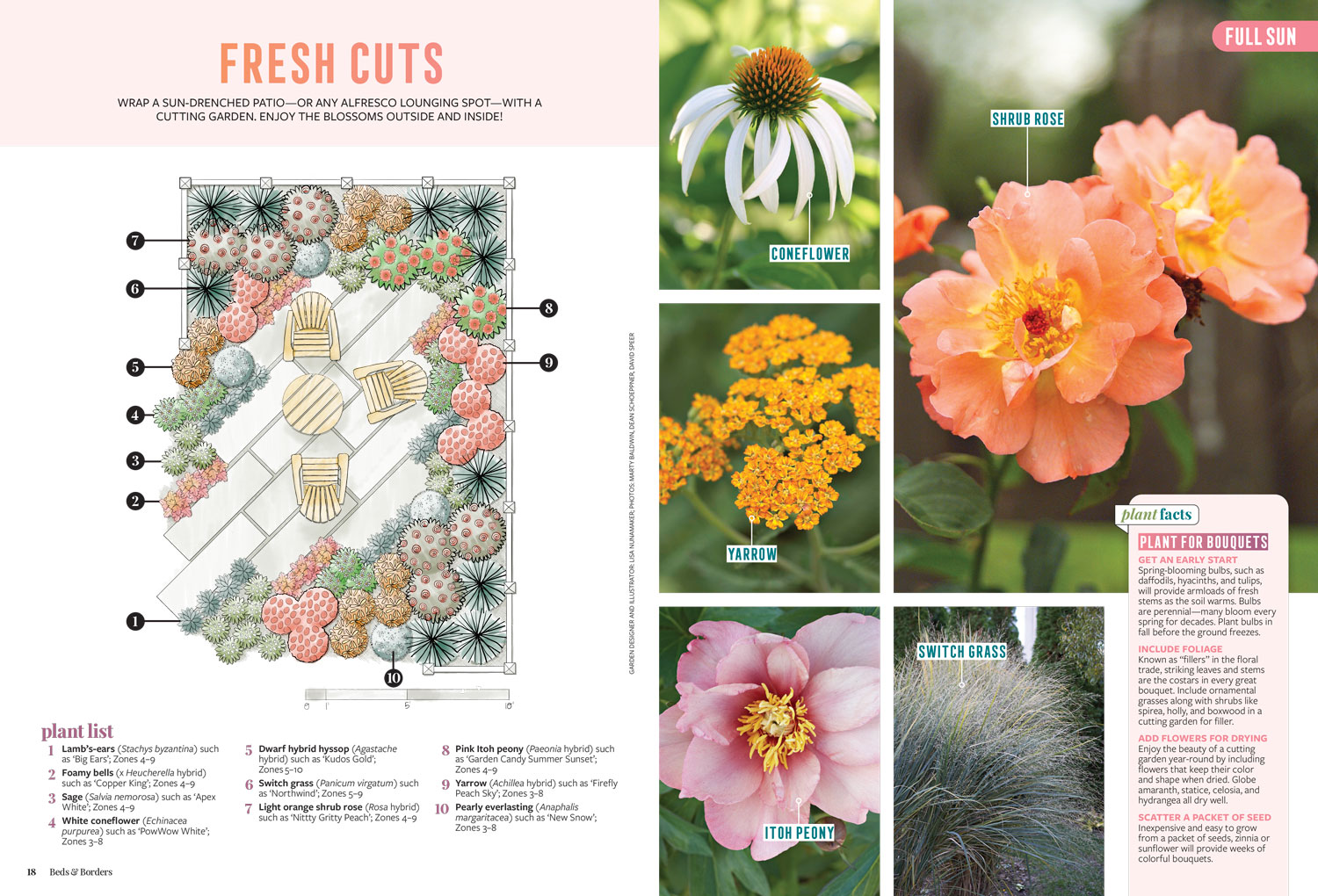
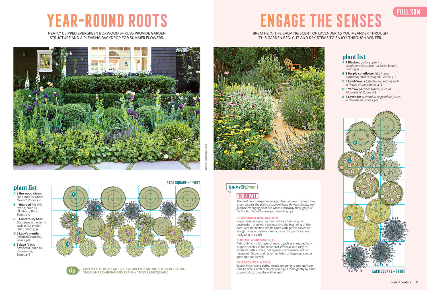
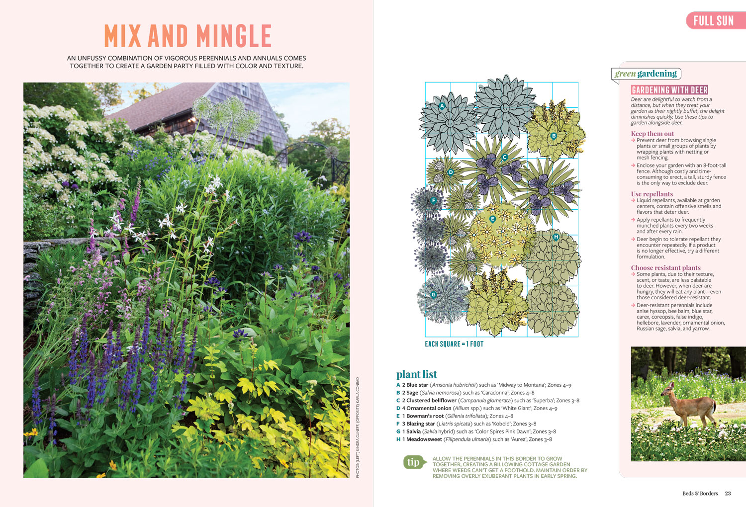
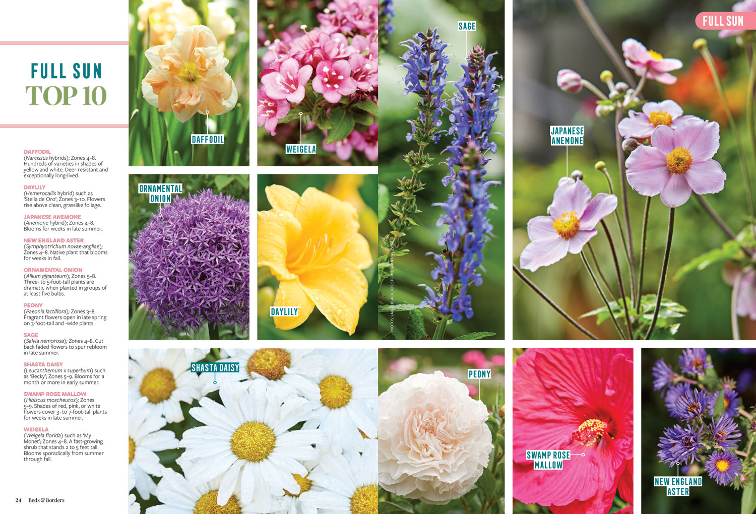
This magazine was comprised of existing photography and new illustrations. We hired an illustrator to create plant icons that we could pick up and rearrange onto a grid to coordinate with each existing garden photo. This gave the editor and myself the freedom to create what we needed without having to sketch specific examples for the illustrator. These plant icons will be able to be repurposed in future garden content across all Better Homes & Gardens brands, which will be an excellent resource. Additional note: due to the sales success of this issue, it has gone on to be reprinted.
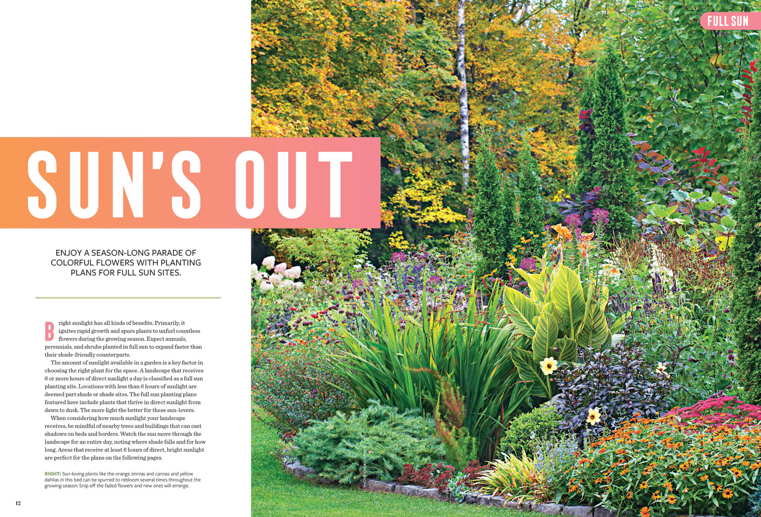
Sun’s Out: All of the chapters in this issue were structured in a similar format: image of a garden space, a grid plan of that space, and a coordinating plant list. The editor and I worked on adding in sidebars and tips as needed to help support the content. Each story also included a detailed illustration (created by a freelancer) and example photos of the plants used, on the opposite page. Finally, each story ended with a gallery of plants that fit the overall theme of each chapter. There were 7 chapters total, catering to different needs gardening needs. ︎︎︎
MEDITERRANEAN DIET (BETTER HOMES & GARDENS)
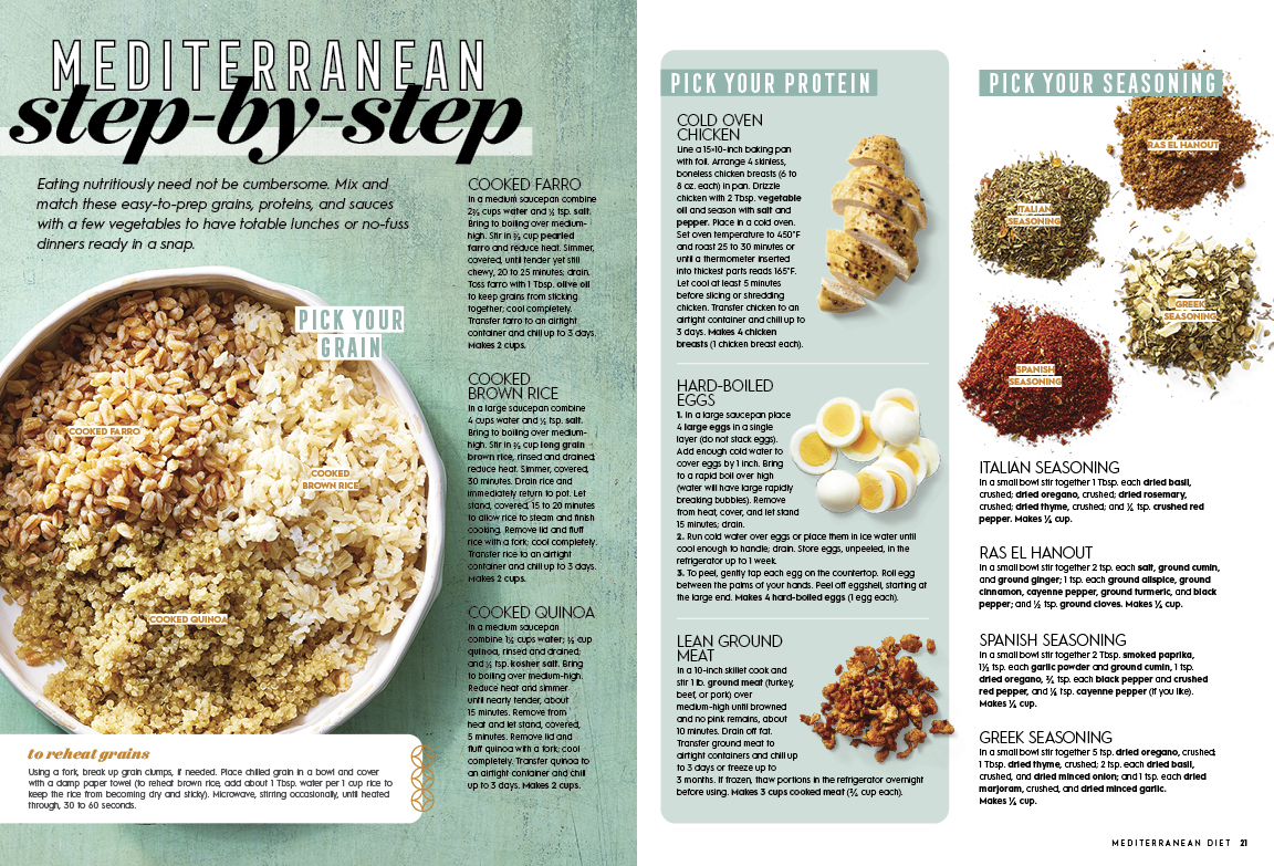
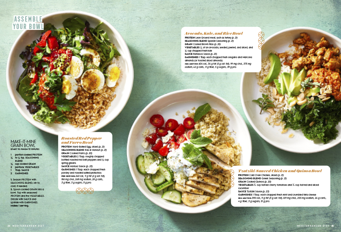
This magazine was comprised of a mix of new and existing photography. The title editor and design director worked together to determine which recipes would be shot new. When I came on board, the photography process was just getting underway, so I attended the photo shoots to get a better idea of how the overall food and recipe process worked. Additional note: due to the sales success of this issue, it has gone on to be reprinted.
All Aboard: While on set, I worked with the title editor to reimagine how this story would be structured. The original idea planned by the design director was to have a bowl on each page, each food element being added one at a time; for example, the first page would show three bowls each with their own grain, then the second page would show those same bowls with different proteins in each, and so on. I felt that it would be too much visual repetition, so I proposed the design shown below. We worked with the food stylist and photographer in the moment to create these scenarios. ︎︎︎

EASY GARDEN & OUTDOOR PROJECTS (BETTER HOMES & GARDENS)
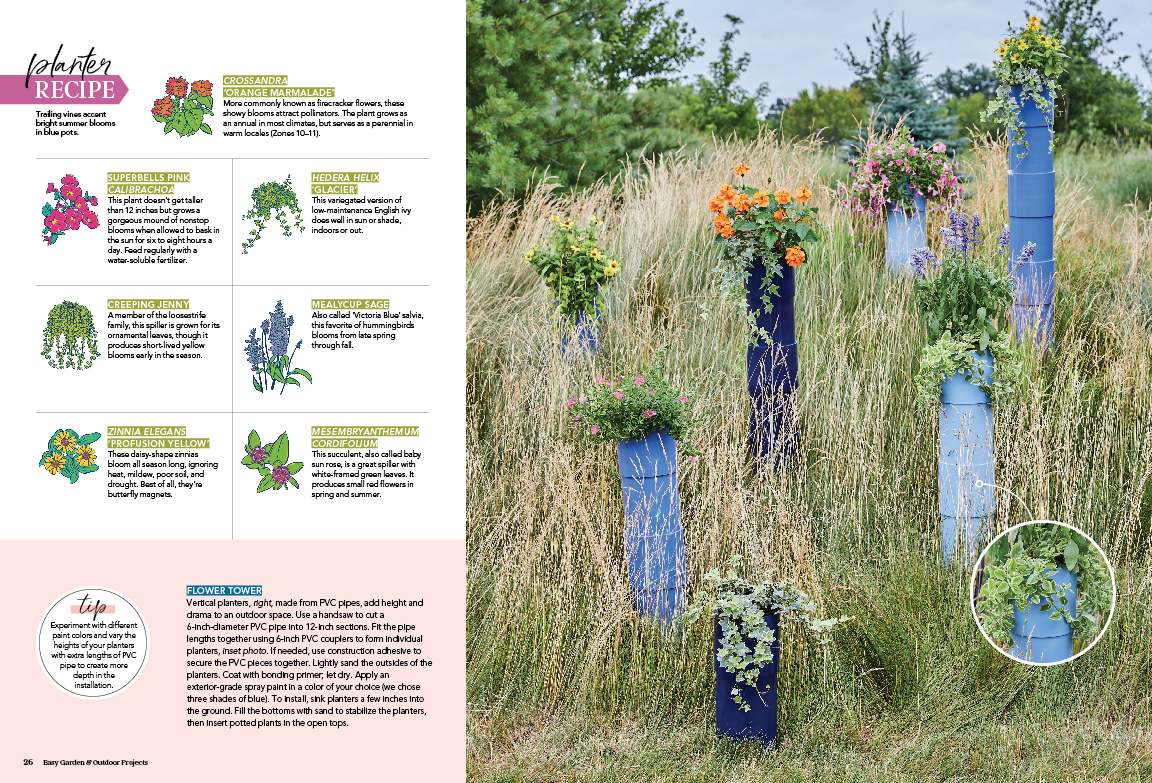
This magazine is mostly comprised of existing projects and photography, paired with new commissioned plant illustrations. There are several home garden tours mixed in with gardening projects.
Creative Growth: This story is all about creating container gardens for outdoor spaces, for which we include instructions for at the end of the magazine. Accompanying each container, we have “planter recipes” which tell readers the exact plants shown in the photos. The illustrations are paired with text giving a brief explanation of the plants. Planter Recipes are used consistently throughout the issue. ︎︎︎



SOUPS & STEWS (BETTER HOMES & GARDENS)
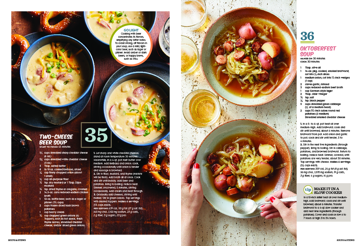
This magazine is a “best of” issue, which is comprised of Better Homes & Gardens recipes and photos that have been featured in various other titles under the brand. Instead of having stories or chapters, the issue mixes all ingredients and categories of soups and stews, numbered 1–100. As the designer, I was able to place the recipes in any order I wanted, so I made sure to separate images by: food color, background color, ingredients/food texture, photography angles, and number of bowls per image. Throughout the issue, there are “flags” to identify Pressure Cooker, Slow Cooker, and 30 Minutes or Less for which I designed the icons.︎︎︎Additional note: due to the sales success of this issue, it has gone on to be reprinted.



COUNTRY FRENCH
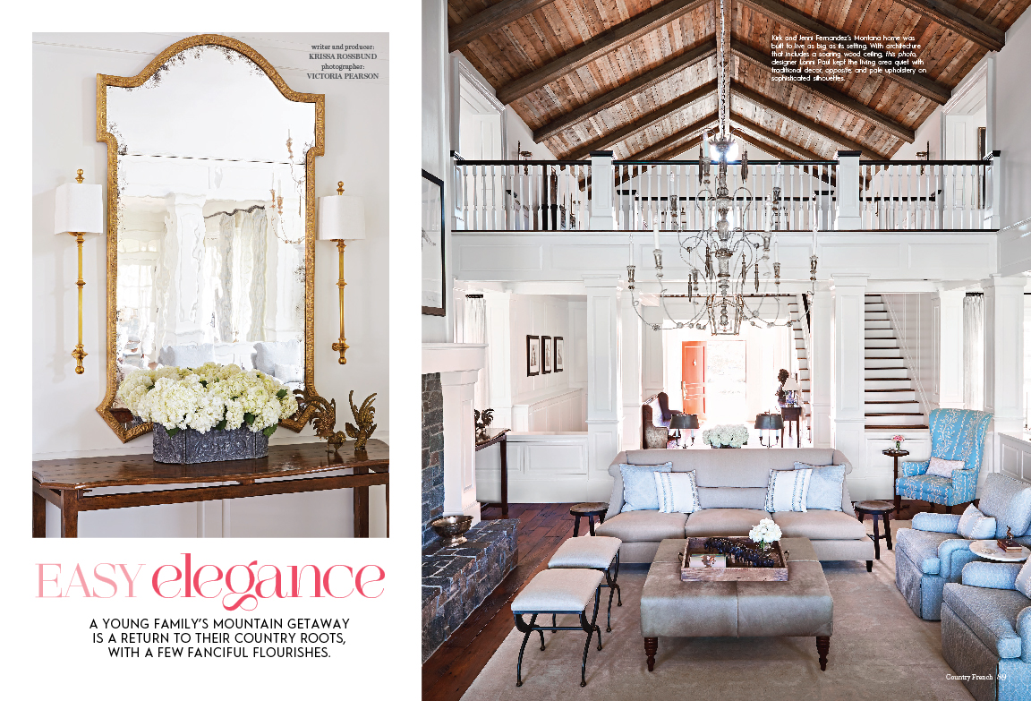
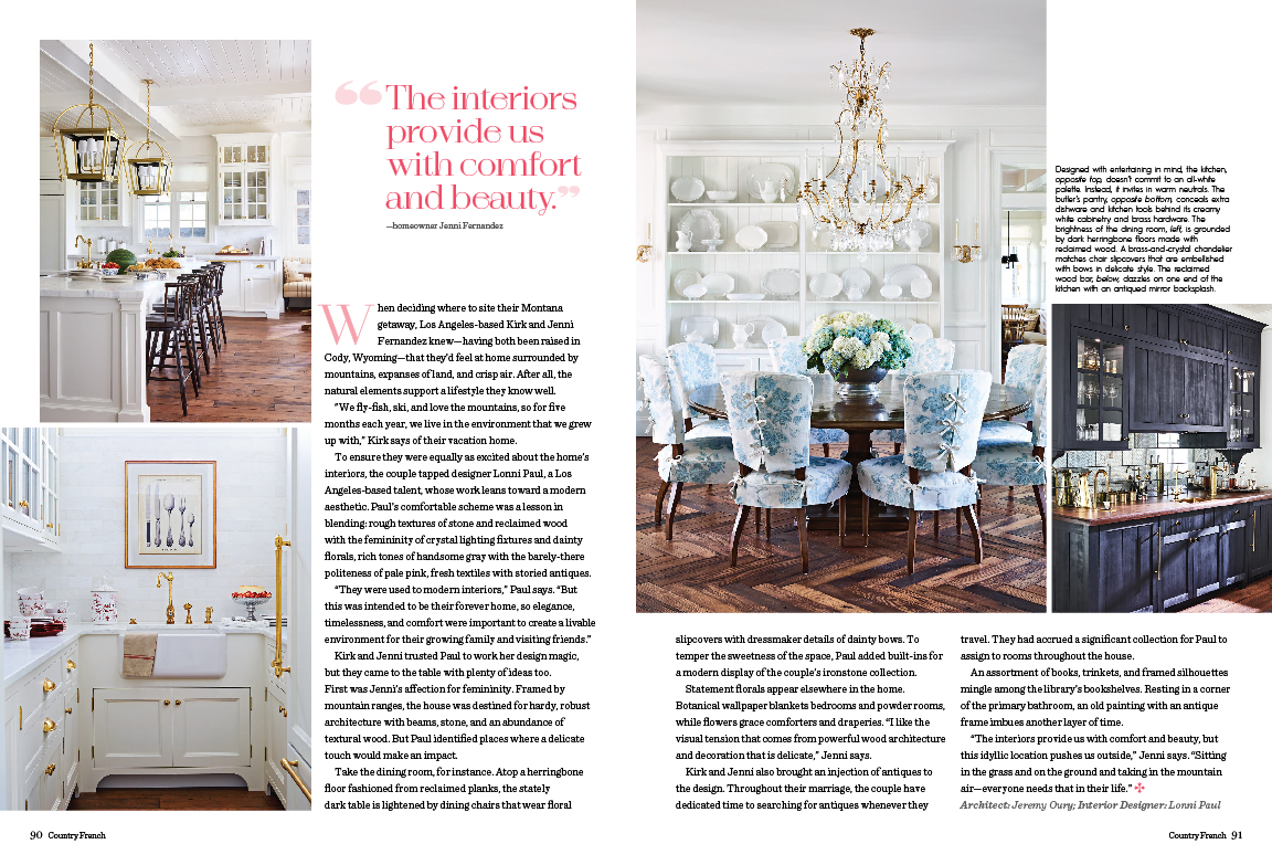
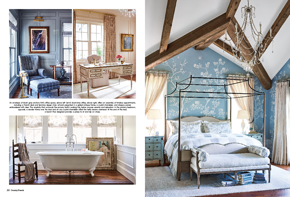
This magazine is a mix of new and existing content. Some stories were repurposed from sister publications, while others were newly acquired. It was important to me to design all of the content in a way that was fresh and ensure the new and existing photography were indecipherable from one another by making a cohesive look throughout.
Easy Elegance: This was my first time designing Country French from scratch. The existing template hadn’t been updated for many years, so I was able to freshen up elements including: fonts, end bugs, symbols, sidebar treatments, and grids. I wanted to convey a sense of elegance that would compliment the photography. ︎︎︎

FLEA MARKET DECORATING (BETTER HOMES & GARDENS)
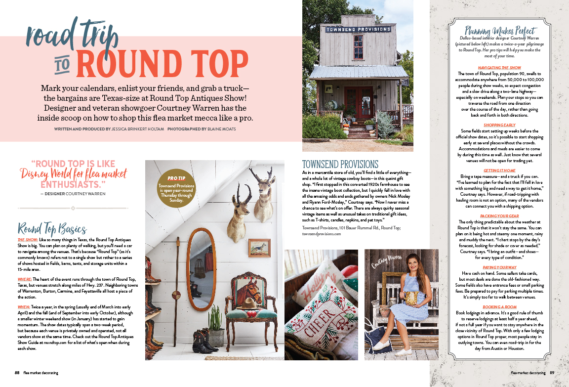
This magazine had existed in years past, but we brought it back because of the resurgence of interest in flea market items and collecting. It was largely centered around home tours and curated collections. Additional note: due to the sales success of this issue, it has gone on to be reprinted.
Road Trip to Round Top: This particular story ran in a sister publication in years prior, but the content is still relevant and informative for readers, so we repurposed it. I was able to reconfigure and condense information into a smaller number of allotted pages from which it originally ran. Since the story contains a lot of information, I wanted to keep the grid structure similar between pages to make it easy for readers to engage with the content. ︎︎︎


TEQUILA & MEZCAL (LIQUOR.COM)
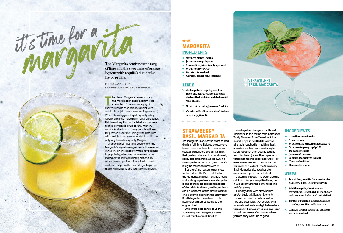
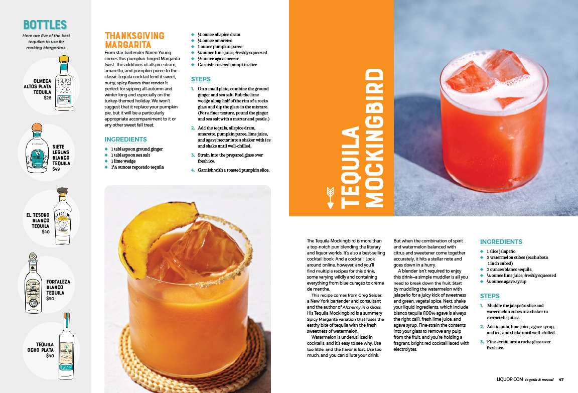
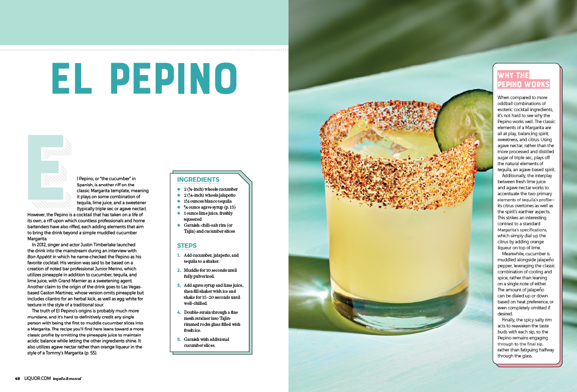
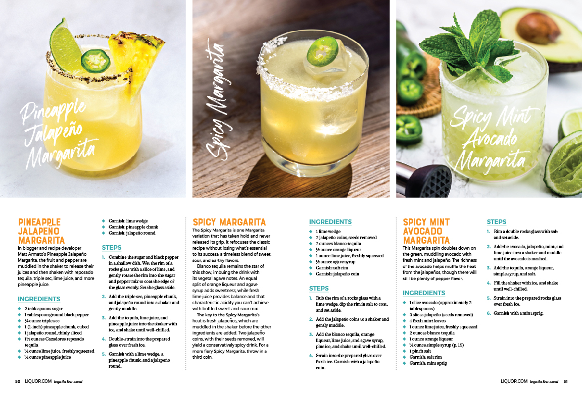
This magazine is the third print publication in which we partnered with Liquor.com to repurpose their digital content to sell in print on newsstands. I created the template to be cohesive with design and typographic elements featured on their website. For each of the three magazines, I kept the basic design elements the same, but changed the color palette to fit the theme and overall feel of each issue topic (Whiskey, Cocktails & Mocktails, Tequila & Mezcal).
It’s Time For A Margarita: These selected spreads are part of a longer story, but is a good visual representation of the overall look of the issue. Each chapter/story has a mix of recipes, recipe history, tips, and bottle recommendations.︎︎︎
QUILTS & MORE (BETTER HOMES & GARDENS)
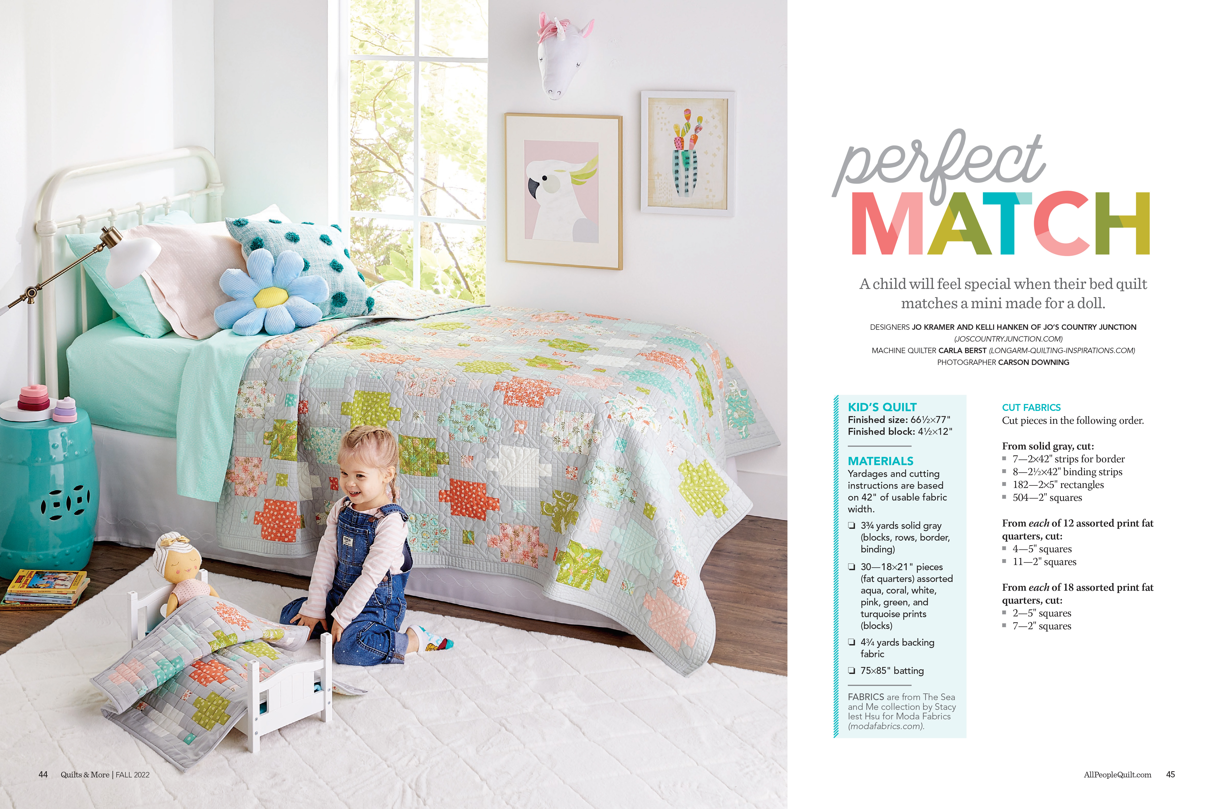
When quilts arrived in the office, I would create a photo plan which included the scenario of the set along with propping notes. Once photographs, instructions, and illustrations were finalized, I compiled everything into a layout. Our practice is to include a styled photo of the project, a flat shot, and all of the necessary instructions and illustrations. It’s important for illustrations to flow into the text where they were referenced, which often dictated the overall flow of the story.
Perfect Match: This is an example of a story that features two projects in one; a twin-size bed quilt and coordinating doll quilt. I wanted to create a scenario where the projects could be featured in one image so readers could understand the difference in scale and how they related to one another. The flat shots appear proportionately correct, which adds to the size clarification. ︎︎︎