Updates & Redesigns
The following are examples of designs that I was able to change and refresh during my time with Quilts & More. I wanted to stay true to the overall feeling of the magazine, but deliver the information in an updated way.
Quilts & More Cover
The cover is an important part of the process, as it’s the first thing a consumer sees that has potential to draw them in to pick up the magazine. As a newsstand-only title, it was important to include interesting visual elements toward the top of the cover as the rest would likely be covered by other magazines. Careful thought was given to refreshing the cover at different stages. See descriptions below for changes that I was able to implement.︎︎︎
The cover is an important part of the process, as it’s the first thing a consumer sees that has potential to draw them in to pick up the magazine. As a newsstand-only title, it was important to include interesting visual elements toward the top of the cover as the rest would likely be covered by other magazines. Careful thought was given to refreshing the cover at different stages. See descriptions below for changes that I was able to implement.︎︎︎
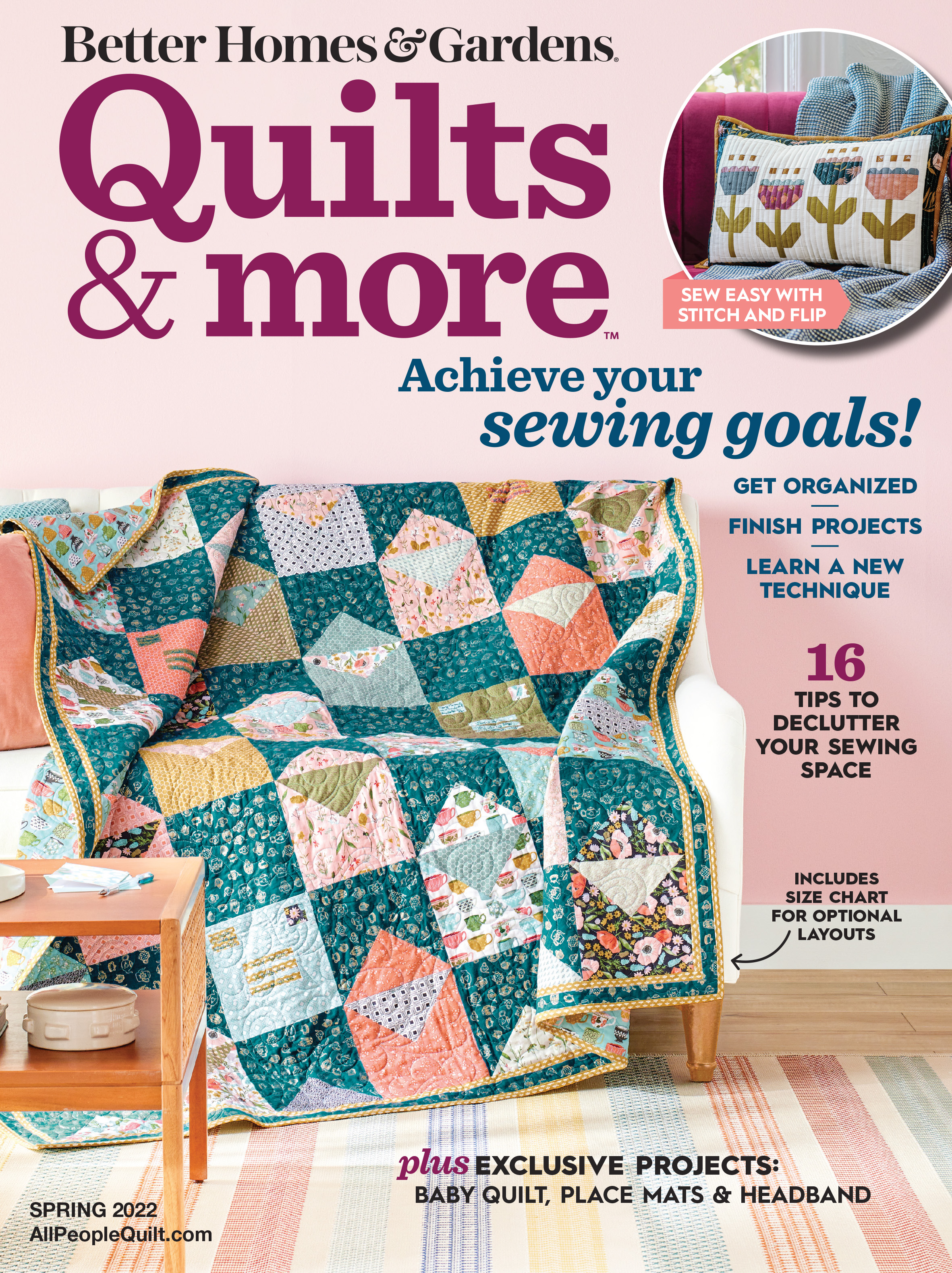
In order to align more closely with other brands and make a more streamlined cover, we decided to eliminate the side rail of photos. This change allowed for more readable blurb space and improved visual hierarchy. This change was made in Spring 2021.
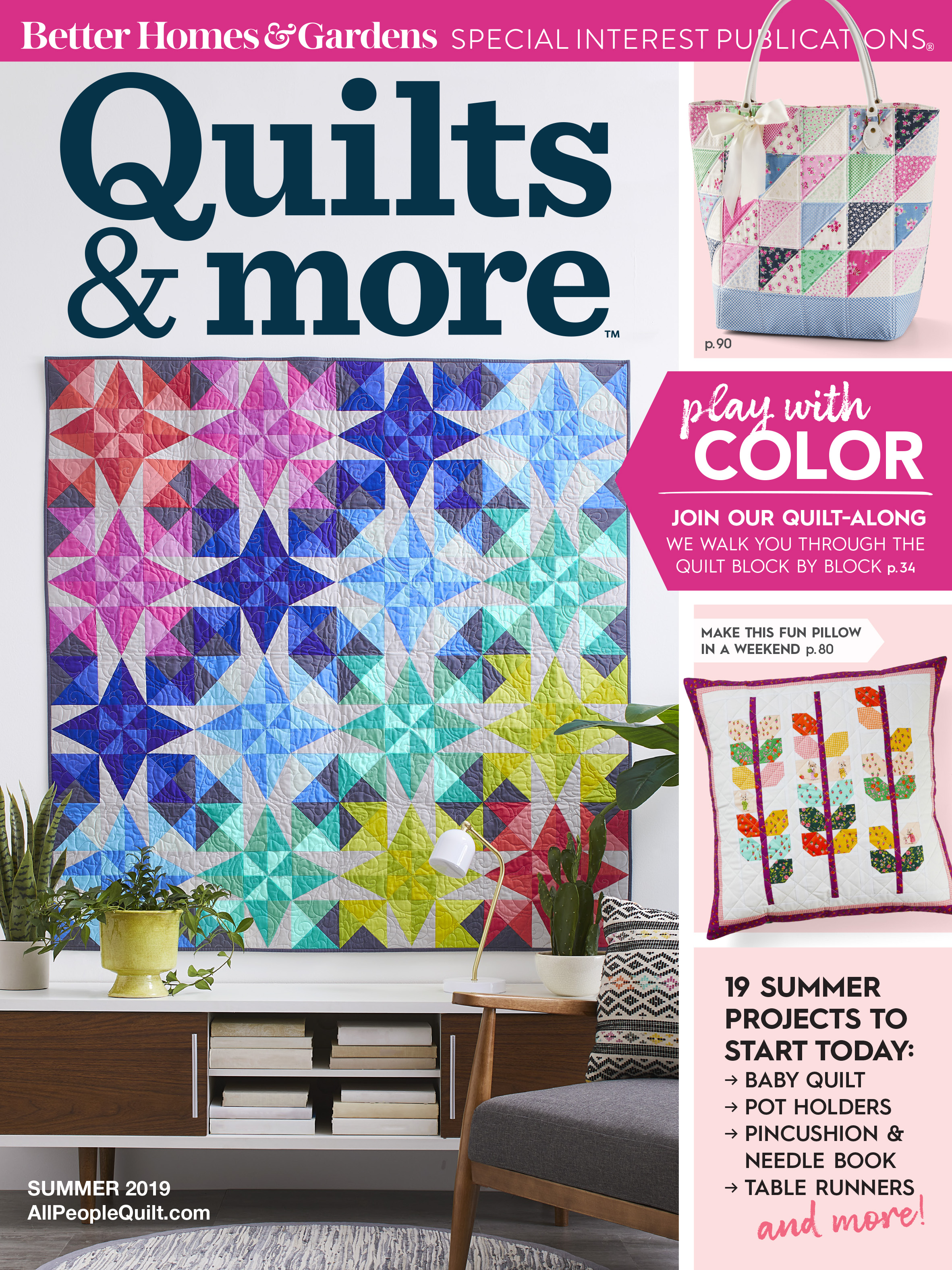
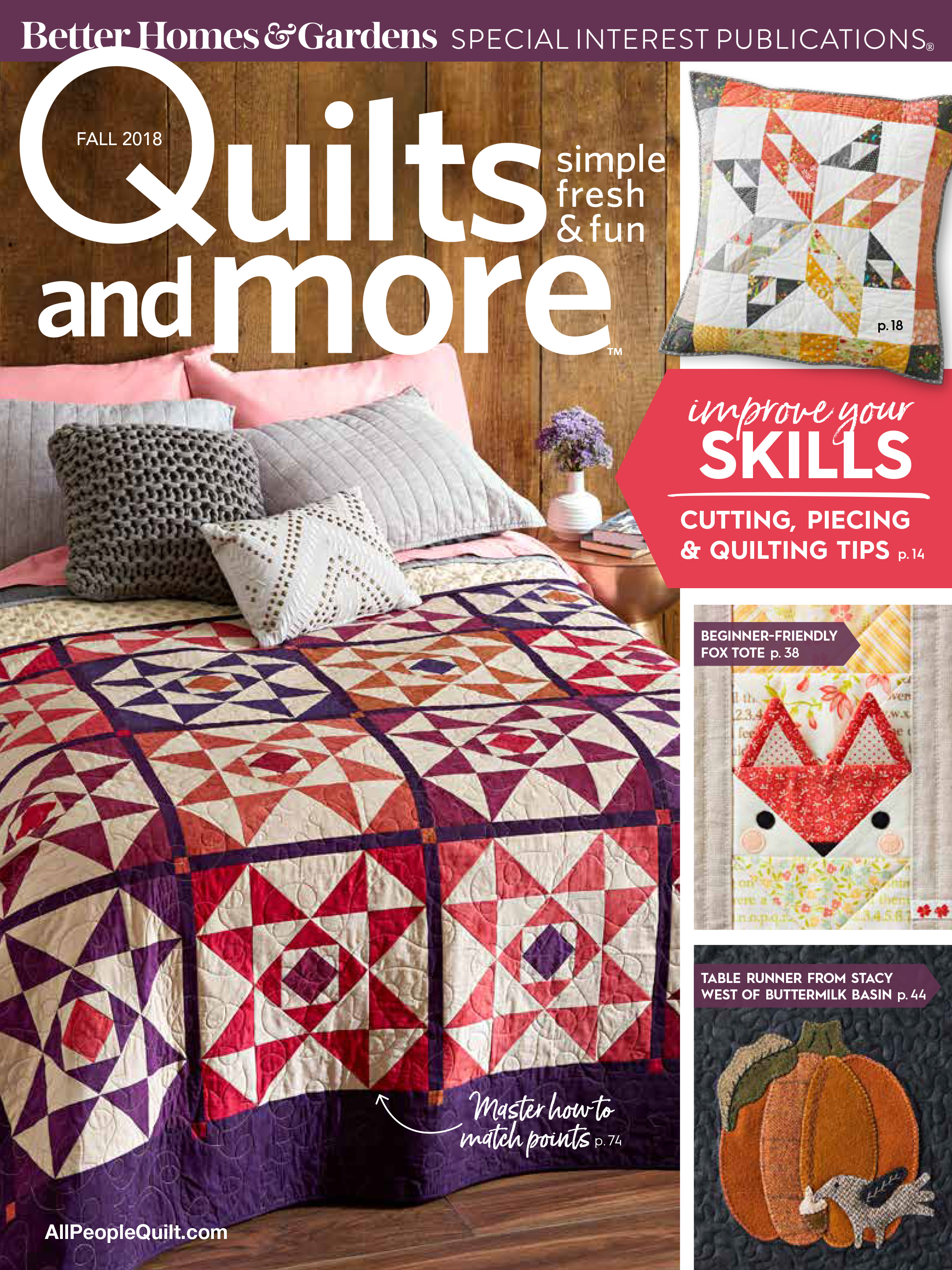
In the Spring 2019 issue, we debuted a new logo design. I wanted to give the branding an updated look that included less elements; I got rid of the issue name in the “Q,” changed “and” to “&,” and removed the tagline “simple fresh & fun.” All of these changes, along with an updated font made for a quicker read on newsstands. The new logo was updated across all brand materials.
This was the original structure of the cover, which featured one main image and three additional projects on a side rail. It was important to highlight a variety of projects through visuals and/or text.
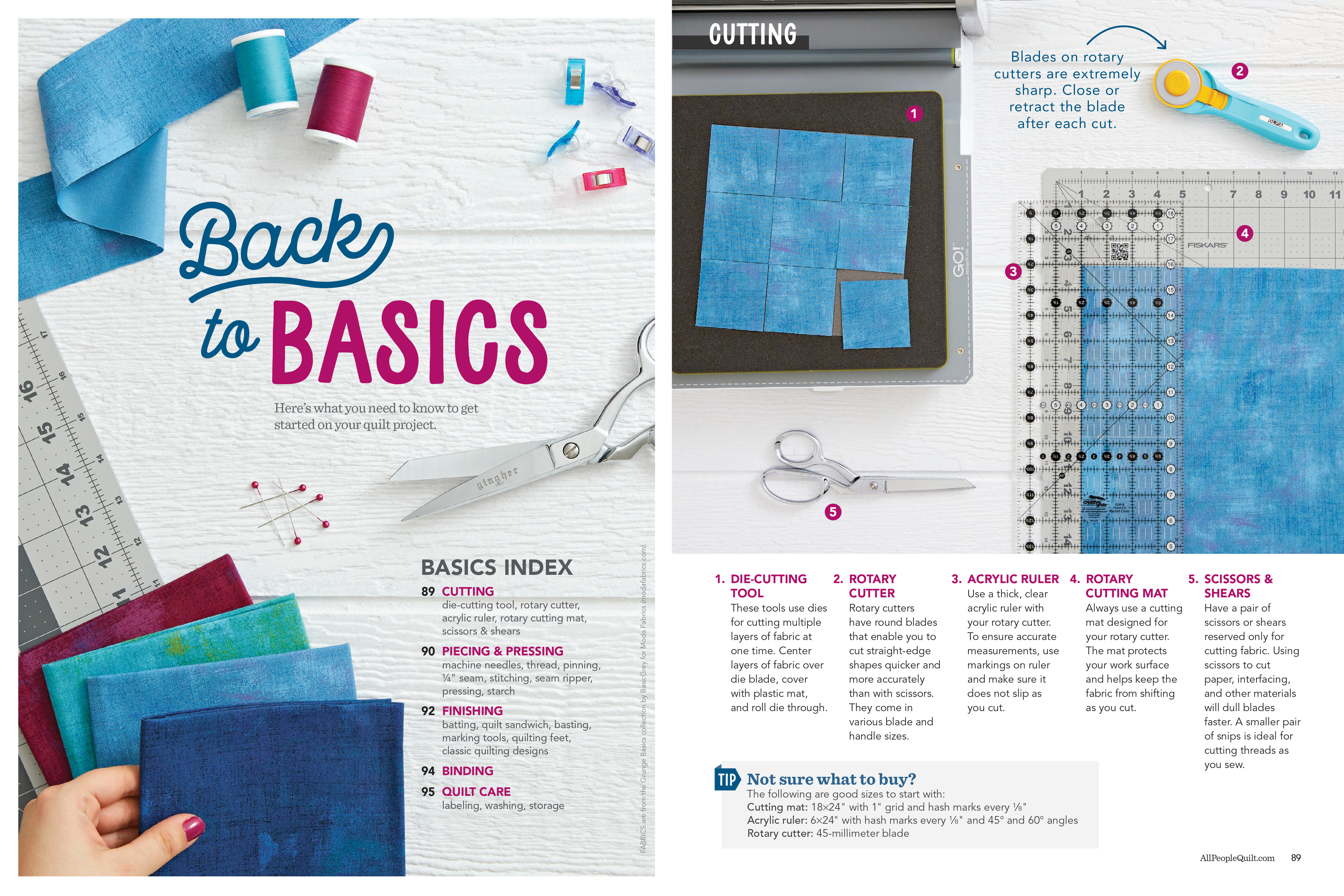
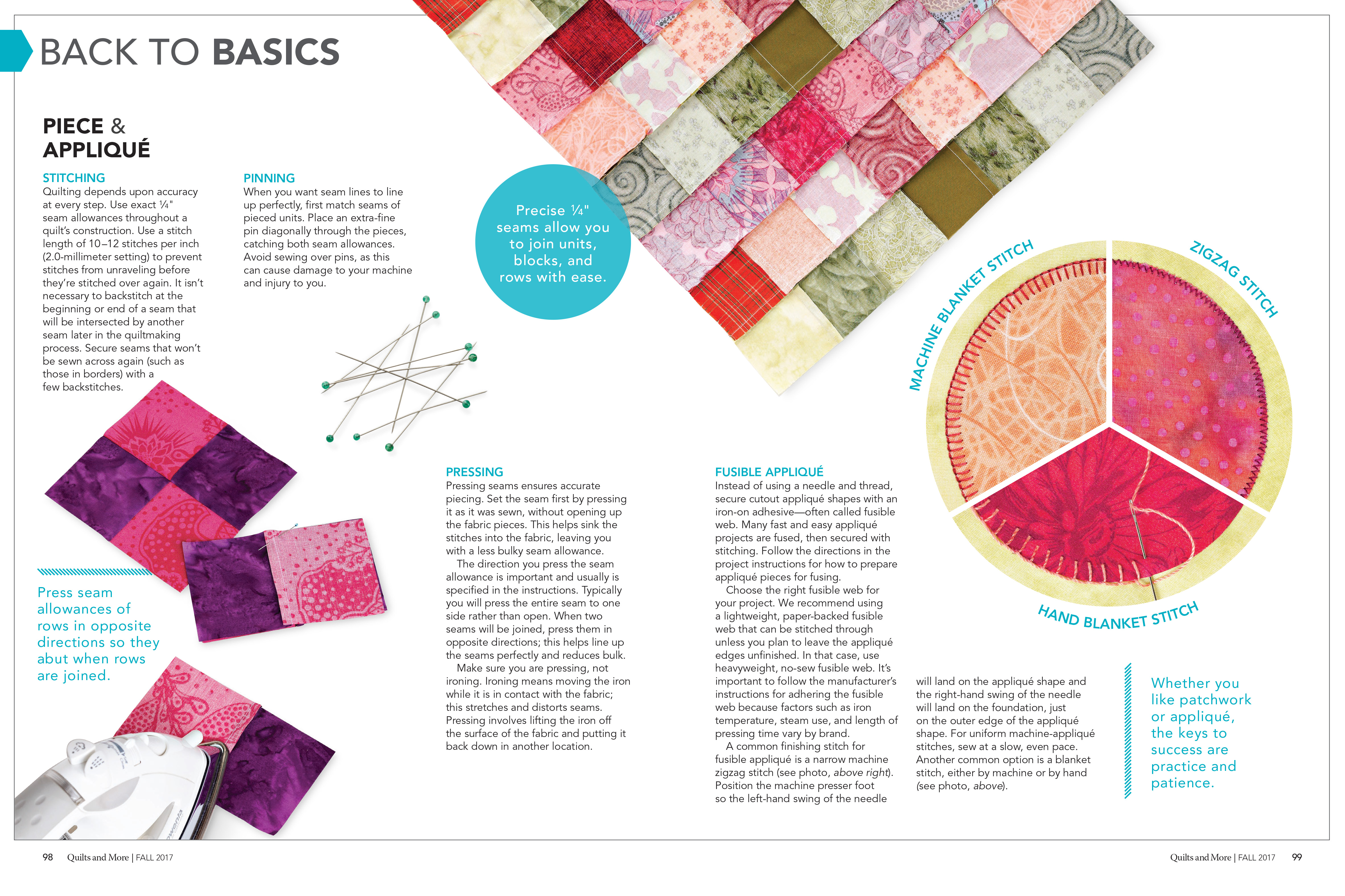
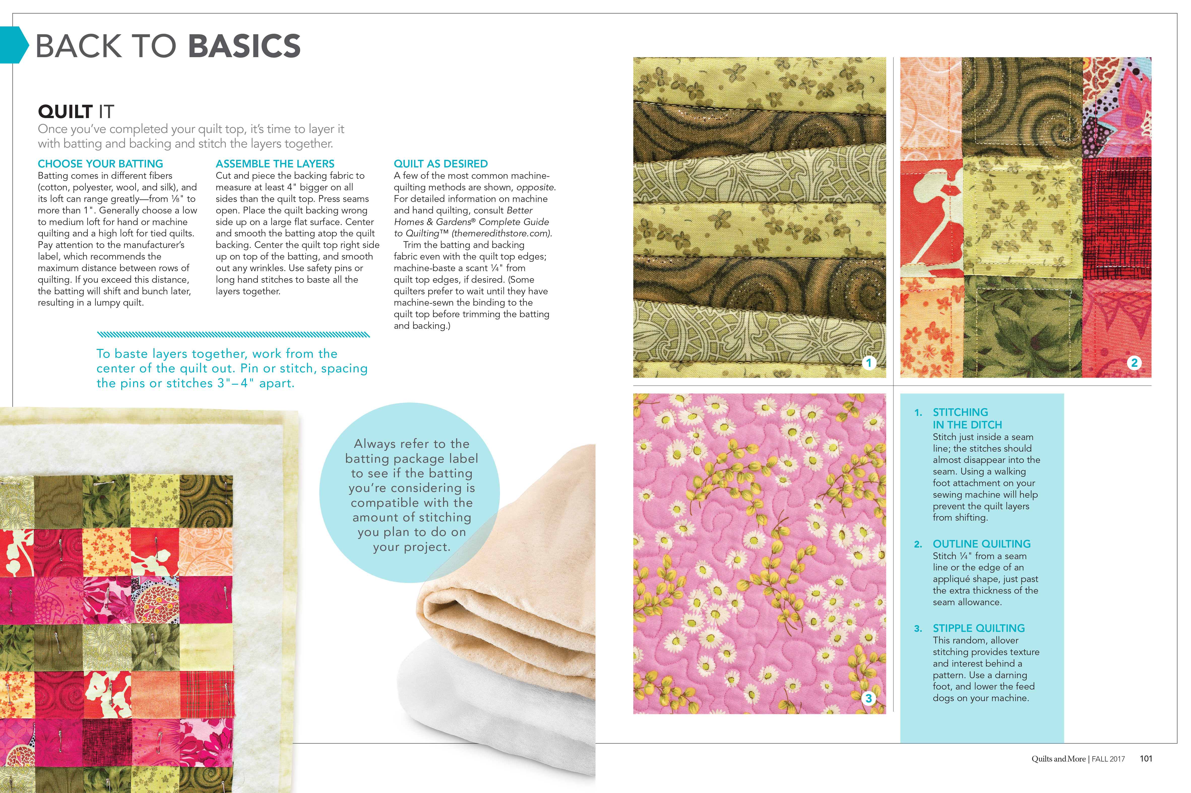
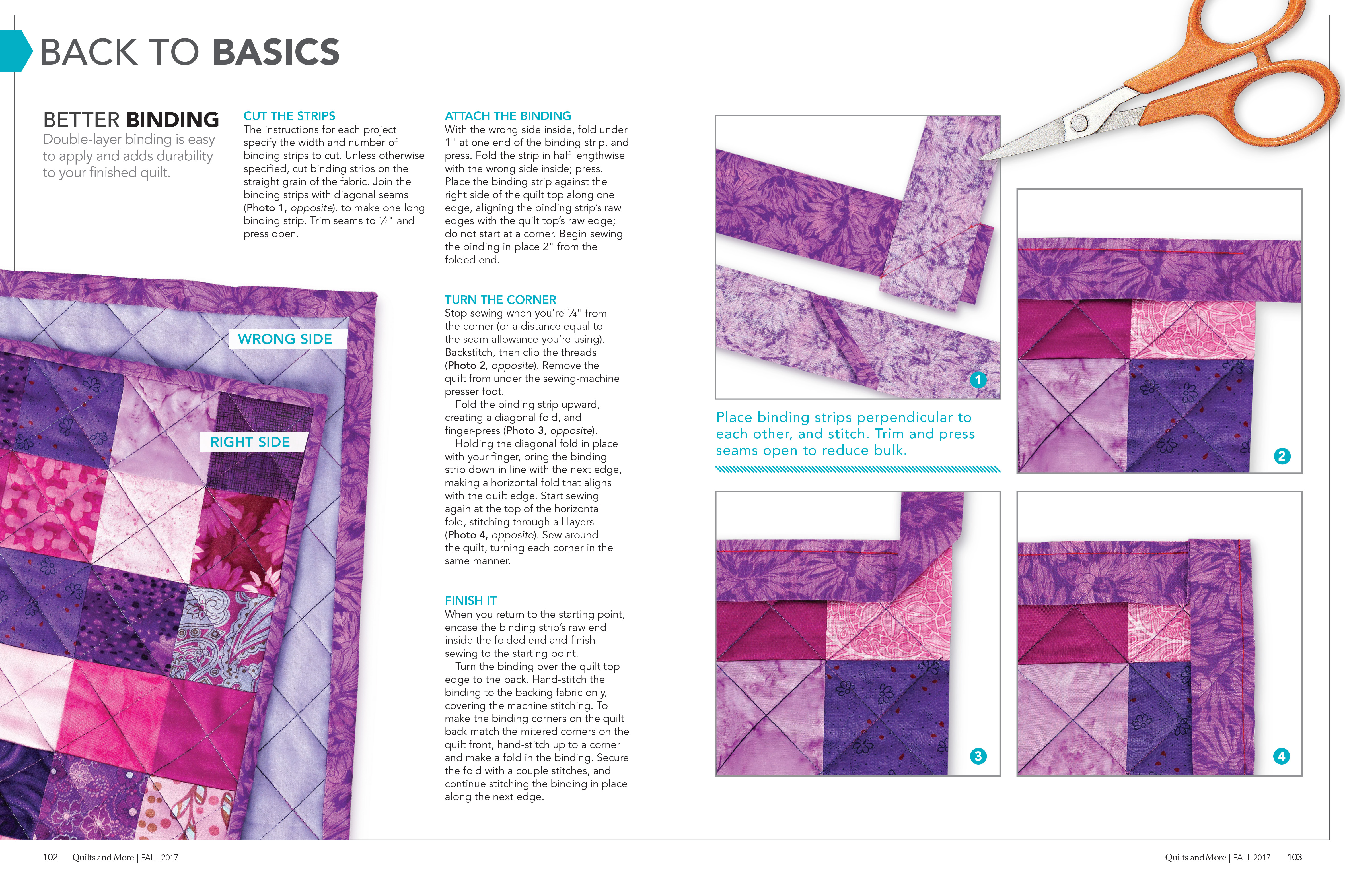
Back to Basics
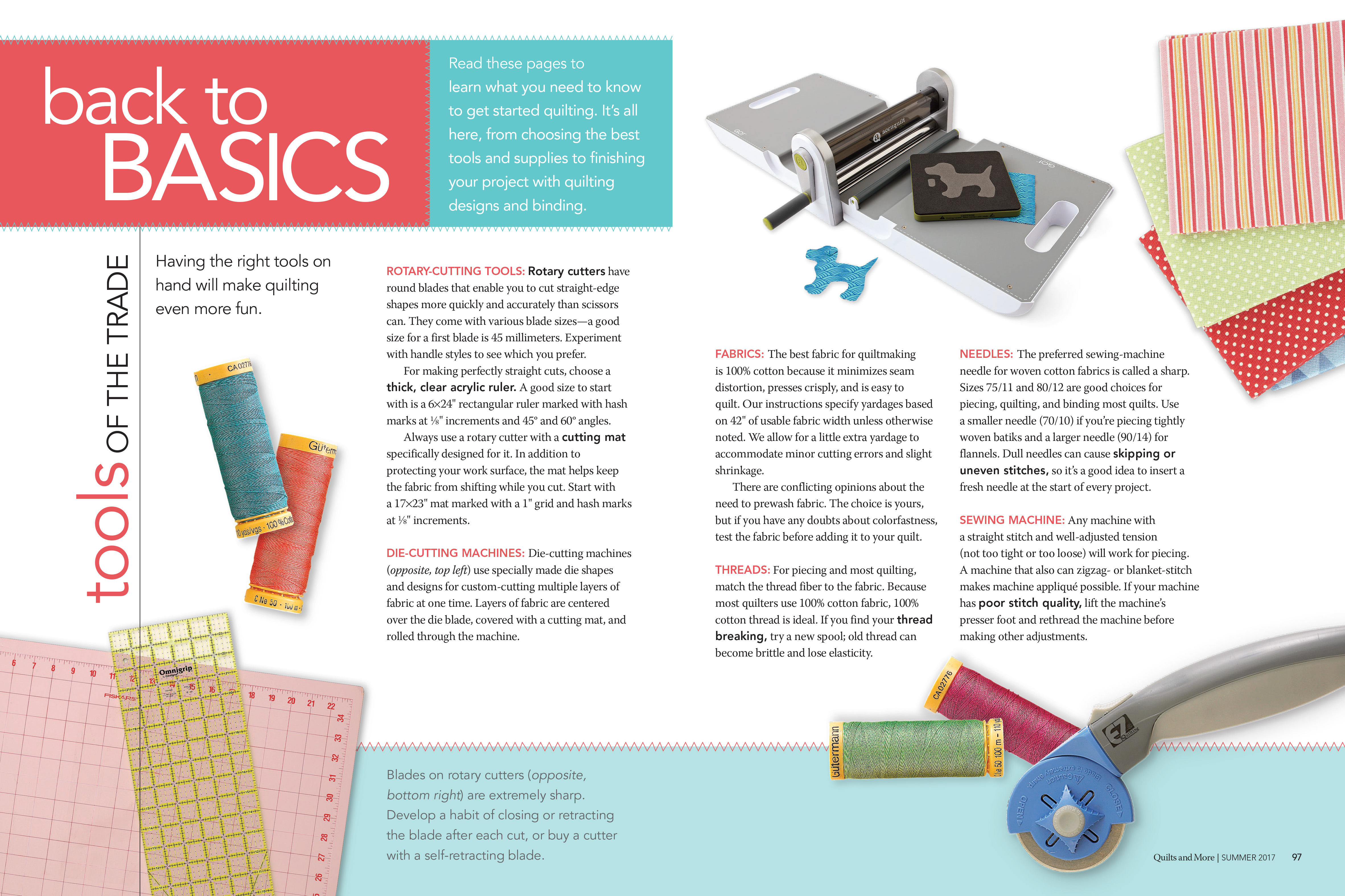
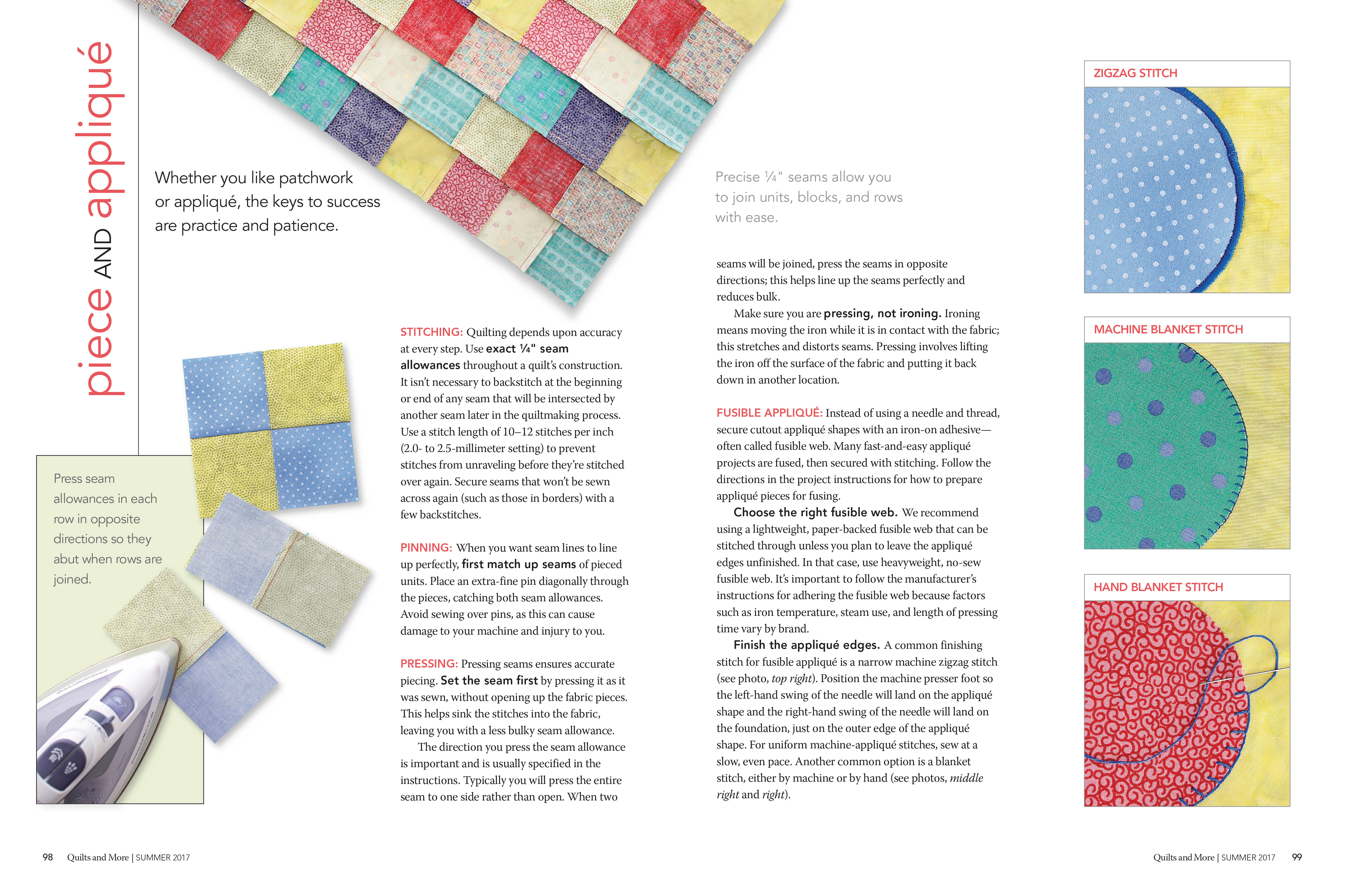
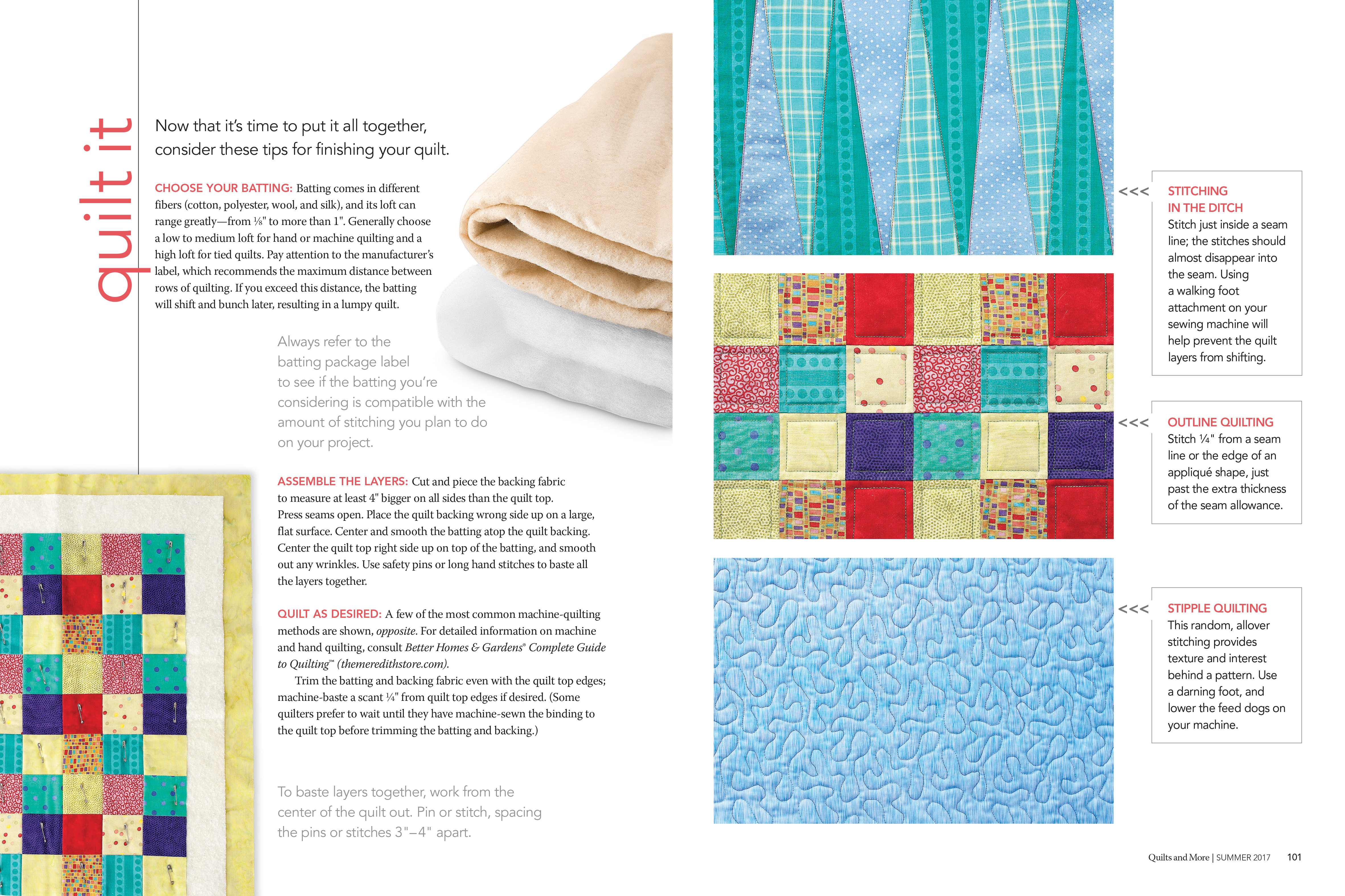
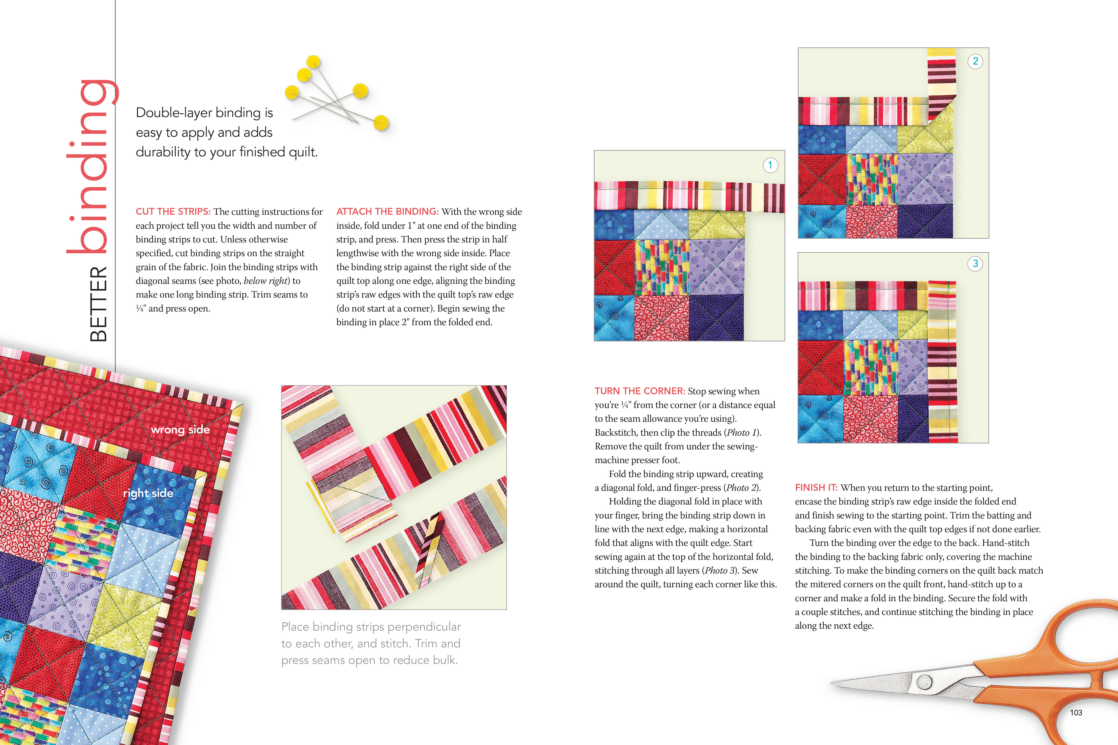
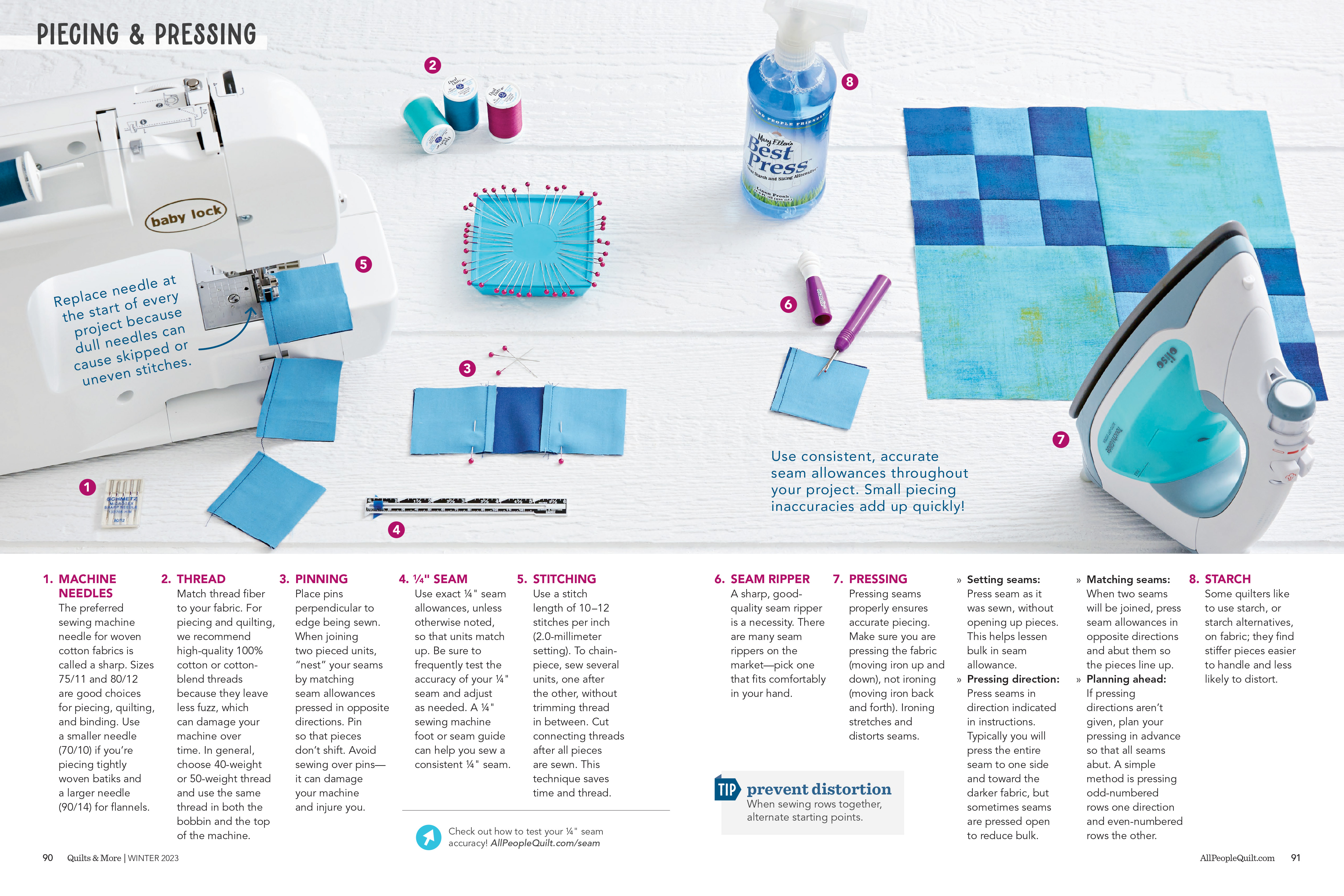
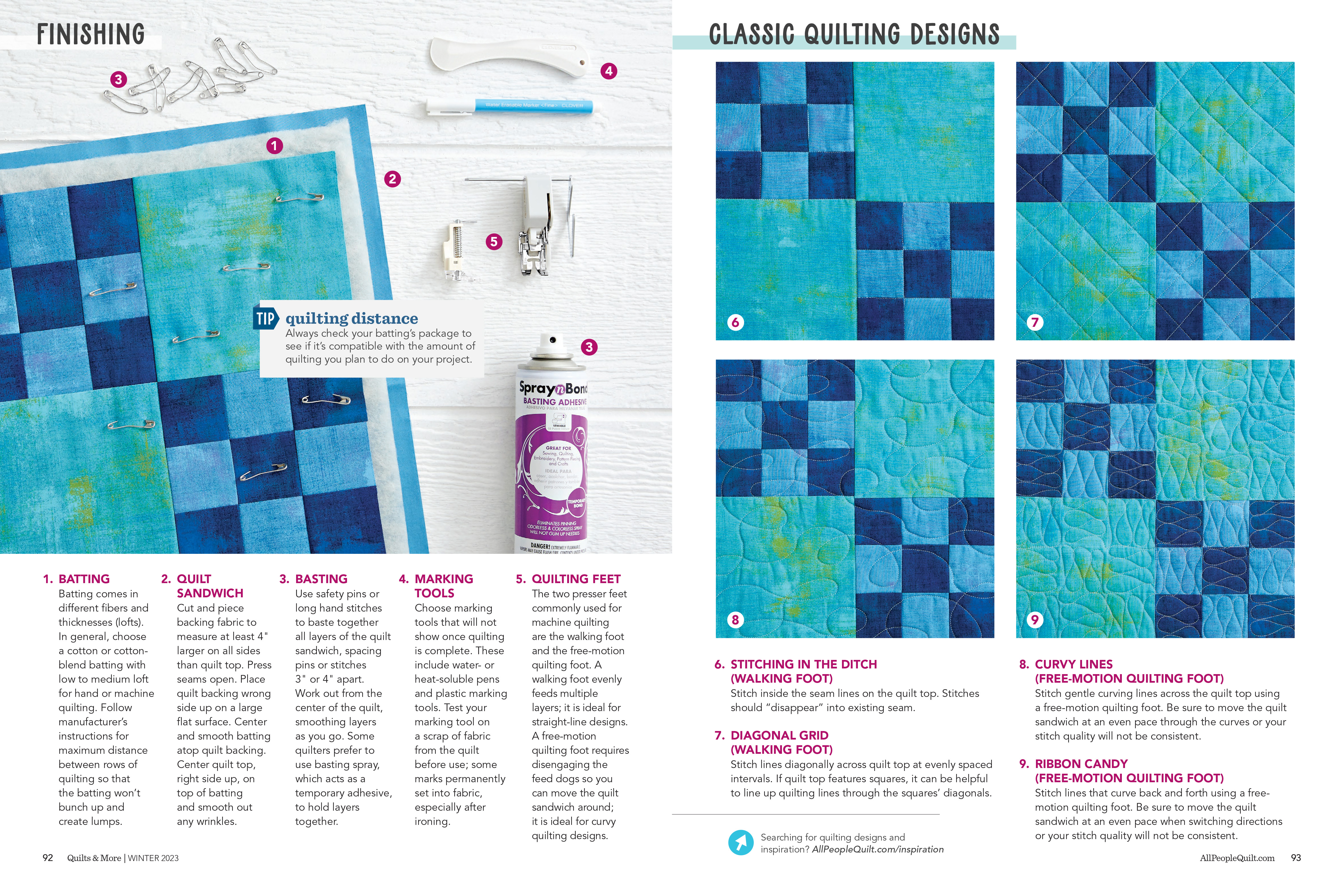
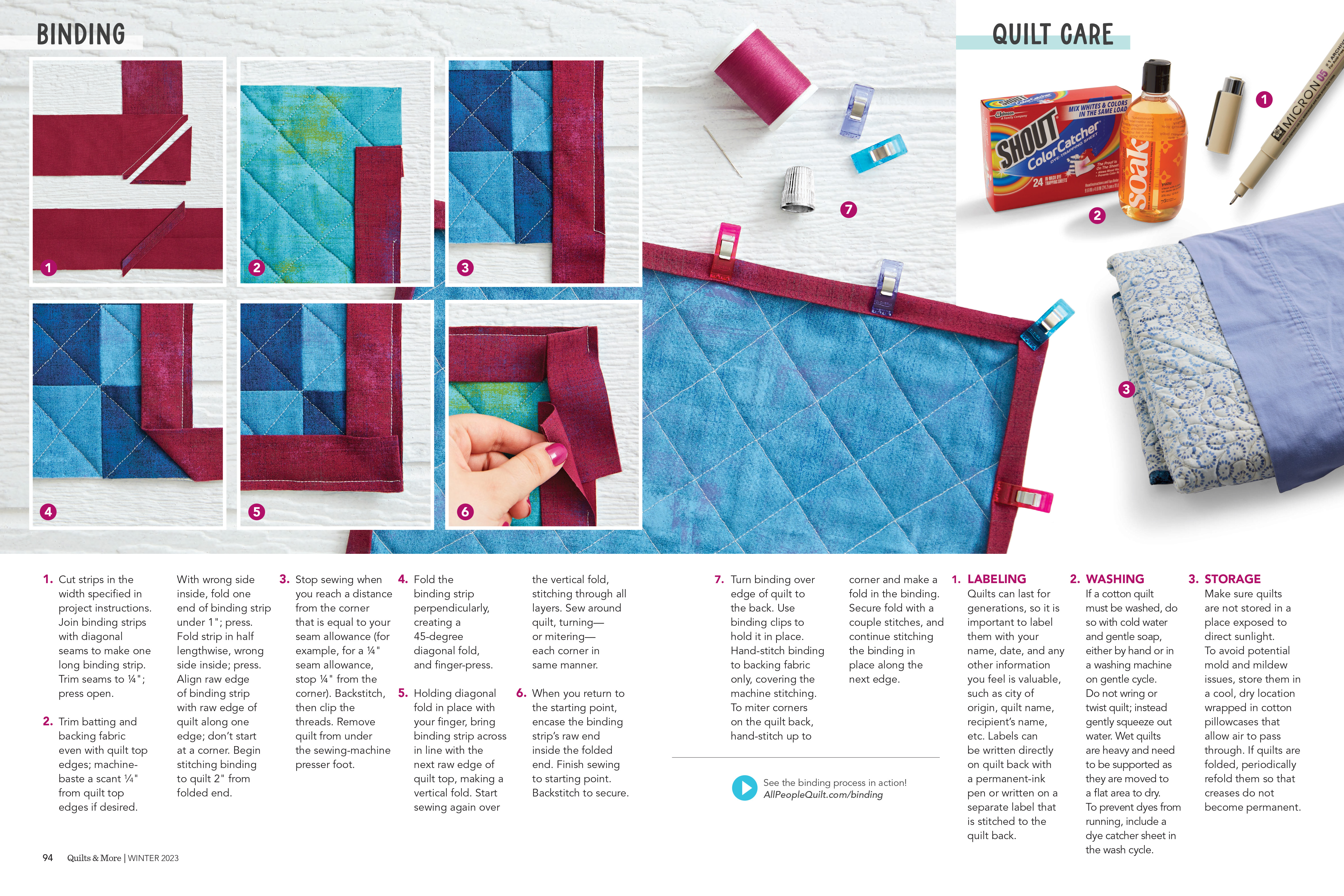
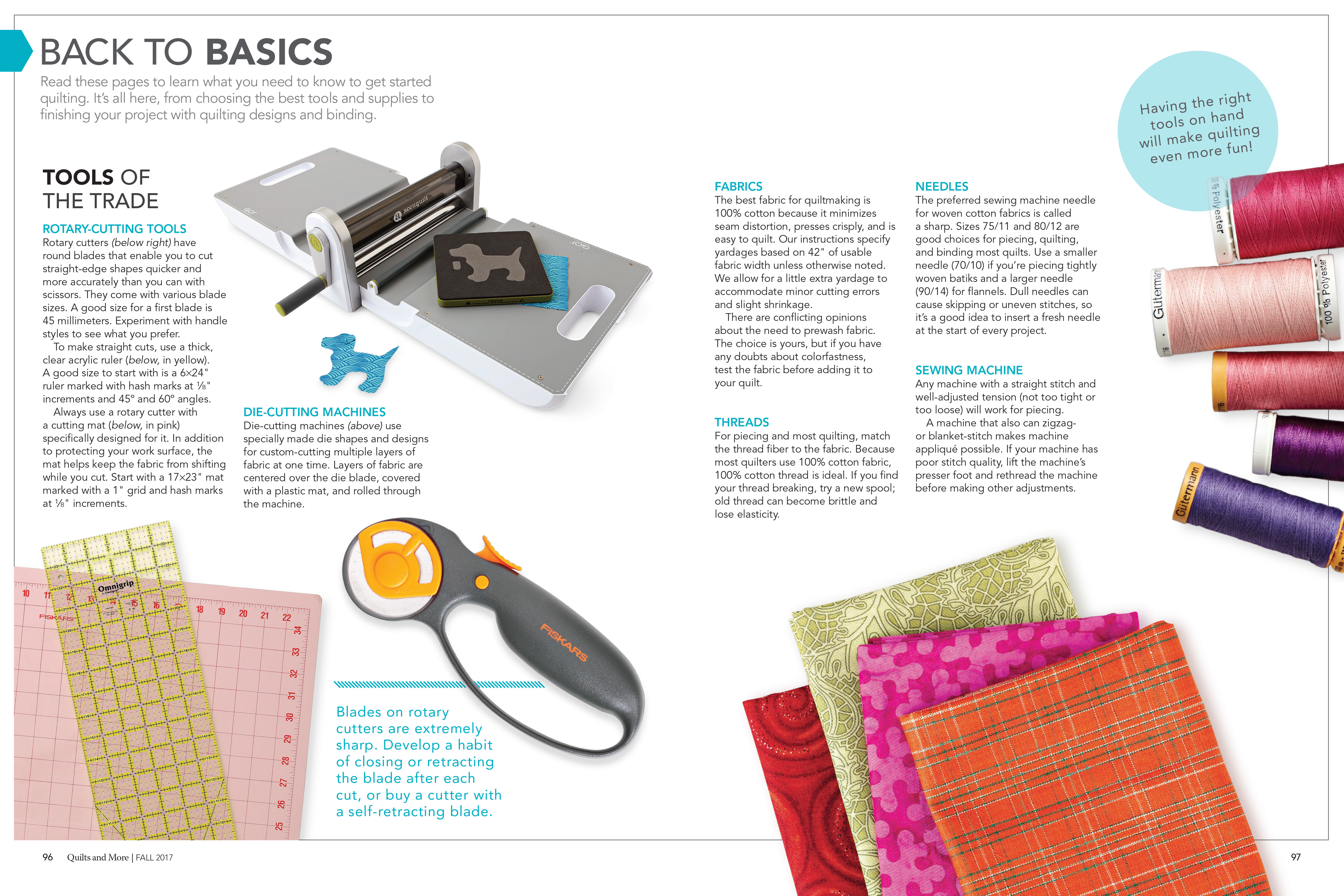
Back to Basics was a recurring feature at the back of each issue of Quilts & More magazine. The story was created to help people through the basics of sewing and quilting. Every project in the issue made at least one reference to Back to Basics so readers could learn without having to include that information with each project.
Redesigned in 2018: For the redesign, I knew I wanted to use the same fabrics throughout the entire story to keep it cohesive. It was also important to select fabrics that were neutral in terms of print and pattern, because I wanted them to be able to last for years to come. After sketching out each page of the story, I propped and art directed the photography. These images have been reused in other magazines and online content. ︎︎︎
Refresh in 2017: For my first issue as designer of Quilts & More, I decided to refresh the content through existing photography and different design treatments. I was able to find additional photos that were taken at the time that had a brighter color palette and used those images, along with a slightly different design to give the story an updated look. The plan was to have this as a temporary solution until the title editor and I could collaborate on coming up with new visuals along with updated tools and information. ︎︎︎
Original: The original design for Back to Basics (created in 2005) included excellent information which helped readers make and finish projects in the best way possible. Though the information held the test of time, the fabric, notions, and color palettes became outdated. ︎︎︎